
Template Builder User Guide
Version 1.2 | Published April 26, 2019 ©
The Template Builder Window
The Template Builder window is located to the left in the application and is where all the customization of the template is carried out.
It consists of two tabs:
Model
Field Tree
Each line in the Field Tree displays the field´s ID and label and often corresponds to a value in the Fill In Form, see the red arrows in the figure below. The associated icon indicates the Type of the field.
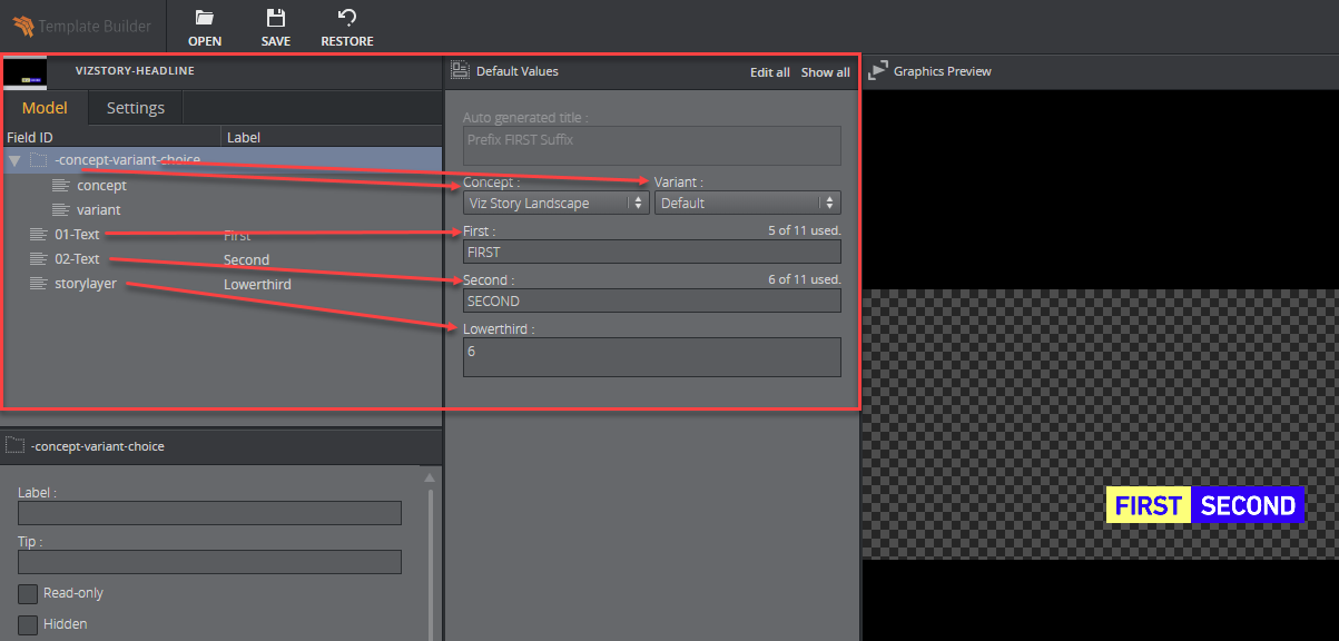
The listing of fields can be rearranged by drag-and-drop within the Field tree.
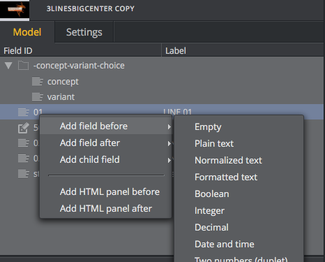
Right-clicking a field, a list of choices appears. From here additional fields and HTML panels can be added.
The Fill In Form will immediately update upon any change.
Info
Only fields created in Template Builder can be deleted and given a new ID.
Multi-selection
It is possible to multi-select in the Field Tree. Additional fields may be selected by CTRL + click. It is not possible to move or rename multiple fields at the same time, but multiple fields can be deleted and some of their properties can also be changed from the Field Properties window.
Field Properties
The Field Properties window is located below the Field Tree window. It displays the properties of a selected field(s) in the Field Tree.
-
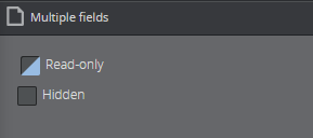
Multi-selection - If several fields are selected in the Field Tree, a subset of the field properties for the selected fields are displayed. If the selected fields have different field property values, the Field Properties window displays a multiple values state. Changes made in the Field Properties window are immediately applied to all the selected fields.
-
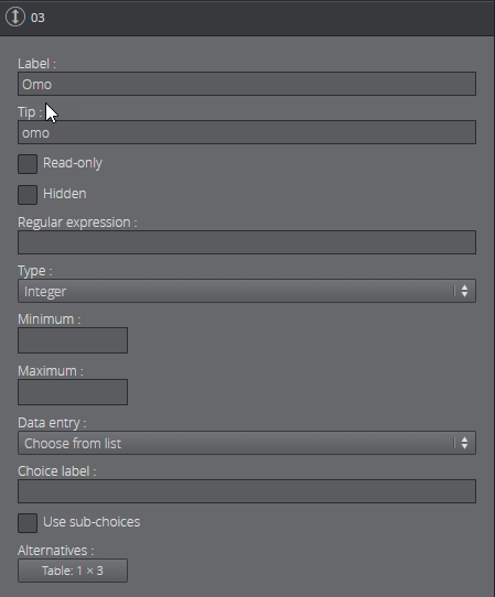
Single-selection - All properties for the selected field are displayed. Note that the set of properties depend on the type of the field.
Label
Specifies the label of the field in the Fill-In Form.
Tip
A tooltip text can be entered to give more information about the field.
Read-only
Selecting the Read-only checkbox will keep the field visible, but grayed out in the Fill-In Form.
Hidden
Selecting the Hidden checkbox will hide the field in the Fill-In Form.
Regular expression
In this field, the user can specify a regular expression which will define constraints of the value in the field.
Type
The type of content allowed in the field in the Fill-In Form is set using the drop-down list under Type. Depending on the type selected different sub-choices become available which is specified in the table below.
There are two main field type categories, scalar and list. Fields with all types except the list type are referred to as scalar fields. Fields using the list type are referred to as list fields.
The following types are available:
|
Type |
Icon |
Description |
|
Empty |
|
Will make the field unavailable. Typically used as a container for other fields. |
|
Plain text |
|
The field is a text field. Max length: Set the maximum number of characters allowed in the field. |
|
Normalized text |
|
Normalized text. Max length: Set the maximum number of characters allowed in the field. |
|
Formatted text |
|
A text that allows formatting. Max length: Set the maximum number of characters allowed in the field. Single-line: Check this box to specify that the rich-text editor should only allow one line of text. |
|
Boolean |
|
Creates a checkbox which has two states; true and false. |
|
Integer |
|
The field is an integer field. Minimum: Set the minimum value allowed in the field. Maximum: Set the maximum value allowed in the field. |
|
Decimal |
|
The field allows decimal numbers. Minimum: Set the minimum value allowed in the field. Maximum: Set the maximum value allowed in the field. |
|
Date and time |
|
Use the Date Chooser in the Fill-In Form to select date and time in this field. |
|
Two numbers (duplet) |
|
The field allows two numbers (decimal numbers are allowed). Minimum: Set the minimum value allowed for both numbers. Maximum: Set the maximum value allowed for both numbers. |
|
Three numbers (triplet) |
|
The field allows three numbers (decimal numbers are allowed). Minimum: Set the minimum value allowed for all three numbers. Maximum: Set the maximum value allowed for all three numbers. |
|
Image |
|
Will make the field available for an image. Image Constraints: Enable this option if you want to set constraints on the image. Minimum Size of the image (pixels): Specify the minimum allowed image dimensions in pixels. Both width and height must be at least this large. Aspect Ratio (width x height): Specify the aspect ratio of the image. Allowed Error (%): Specify the maximum stretch limit for both with and height of the image. This is in relation to the defined aspect ratio. |
|
Video |
|
Will make the field available for a video. |
|
Font |
|
Will make the field available for a font. |
|
Geometry |
|
Will make the field available for a geometry. |
|
Material |
|
Will make the field available for a material. |
|
Map |
|
Will make the field available to present and edit a map. |
|
Custom |
|
Using the custom type the media- and XSD- type can be freely specified. |
|
List |
|
Lists may be modified by adding and removing columns in the Field Tree. To add columns to a list, right-click the columns node under the list field node in the Field Tree and select Add column. To remove a column, select the column field in the Field Tree and press the Delete button, or right-click it and select Delete field. List fields are fundamentally different from scalar fields. It is therefore not possible to change a list type to a scalar type and vice versa. Minimum number of rows: Defines the minimum allowed number of rows in the list. Maximum number of rows: Defines the maximum allowed number of rows in the list. |
Note:
The user must be aware of available control plugins in the template that have been exposed by the scene designer in Viz Artist.
Data Entry
There is a Data entry drop-down list available for all scalar field types. There are three choices in this drop-down list, namely Manual, Choose from list and Enable feed browser.
Manual does not open up to any additional settings for the field.
Choose from list allows the template designer to present the right content in a drop-down list.
Enable feed browser allows the user to browse for an entry.
For more information see Data Entry.
Default search parameters
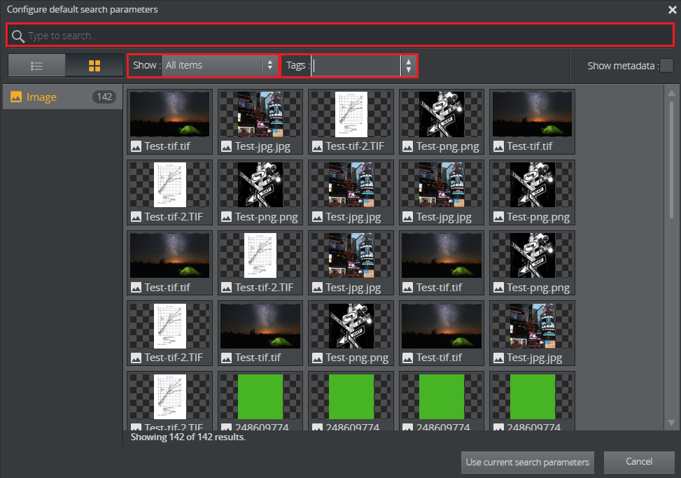
For the types Image, Video, Font, Geometry, and Material it is possible to define default search parameters that will be used by the media search that is launched when the user clicks on the field.
To define the search parameters for a field, click the Set button to open a media search window.
Set the search parameters by writing something in the search field, selecting whether to show all items or to limit by time from the Show drop-down list, and/or selecting a tag from the Tags drop-down.
Save by clicking Use current search parameters.
Settings
The following template settings are available in the Settings tab:
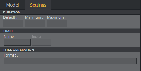
Duration
The duration setting can be used to specify the duration of a graphic on a timeline. A default value is used when unspecified. Minimum and maximum duration values may also be specified. If these are set to the same number the item will get a fixed duration.

Track
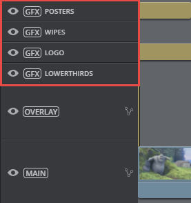
Setting a Name in the track settings allows for grouping of graphics in the timeline editor, see Track settings displayed in the timeline editor. The Index sets the position of the group in the timeline editor, where 0 is the lowest position.
WARNING!
All templates using the same track name must have the same index.

Track settings displayed in the timeline editor
The red rectangle highlights the different tracks in the timeline editor. The position of these tracks is set using the Track setting.
Title generation
The title generation setting allows for auto-generation of the title. The title can be plain text or it can be a placeholder for one or several field values, or it can be a combination. The placeholder is the {Field ID}. An example combining plain text, field name, and subfield name is shown below:


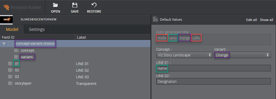
A template title can be auto-generated by combining one or several of these options:
-
Normal text - plain text (red)
-
{Field ID} - will be substituted by the value of the field (green)
-
{Field ID/subfield ID} - will be substituted by the value of the subfield (purple)
-
{listfieldname/#index/cellname} - will be substituted by the value of the field in a row in a list. Note that the index is zero-based.
WARNING!
The auto-generated title does not get trimmed inside Vizrt web clients. However, if the title is longer than 128 characters it will be trimmed when dragging out the MOS XML file due to size constraints. This will affect the element title in the newsroom system.


