Template Builder User Guide
Version 3.1 | Published June 26, 2024 ©
Inline HTML Fragment
In the auto generated form and in the custom layout tabs, it is possible to add an inline HTML fragment. The HTML content of this fragment is restricted to selected tags and attributes (see below). It can be used to insert custom UI elements into the template. The HTML button can also be linked to a click-handler in internal scripting, enabling the possibility to add special functionality when the user clicks the button. The HTML fragments are stored inside the template, so no need to host these fragments on a web server.
Note that external CSS styling is not supported. All styles need to be inline.
Adding an HTML Fragment
The inline HTML fragment can be added both to the auto-generated All tab, and to the custom layout tabs.
Adding an HTML Fragment to the Auto-generated All Tab
-
Right-click the field tree.
-
Select Add UI panel > HTMLfragment.
-
Add an ID to the new field.
The HTML fragment is now a part of the field tree for the All tab.

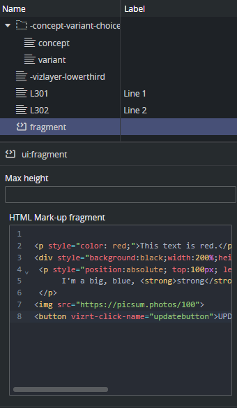
In the field editor for HTML fragments the maximum height can be set and the actual HTML can be entered. See below for HTML tag and attribute limitations for the HTML entered into the box.
Adding an HTML Fragment to the Custom Layout Tabs
For the Custom Layout tabs, the UI components like HTML panels and HTML fragments, are not part of the field tree on the left. They float inside the custom layout tabs and can only be reached by clicking them in the UI.
To add an inline HTML fragment into a custom layout tab, follow these steps:
-
Create or select a custom layout tab.
-
In the middle toolbar, click the Add HTML fragment to current view button.
-
Enter an ID for the fragment.

A new HTML fragment is now added to the form.

-
Click the ruler to toggle edit and view mode:
 .
.
Z-order
In the current version of Template Builder, the only way of specifying the Z-order of the components, is to add them to the form in the right order. The first component added to the form is in the back layer, then each component added has a higher Z-index, and the last component added is on top.
Adding a Clickable Button
Inside an HTML fragment, it is possible to add an HTML button. Scripting inside HTML fragments is not allowed, but there is a way to add an event handler to the button to enable internal template scripting on click.
-
Add a <button> in the HTML fragment.
-
Add a special attribute vizrt-click-name to the button, specifying how a click on this button can be identified in internal scripting.
-
Add an internal script event handler for onClick and check for the value of the attribute above.
In the HTML fragment:
<button vizrt-click-name="updatebutton">UPDATE</button>The name can then be checked for internal template scripting:
vizrt.onClick = (name: string) => { if (name === "updatebutton") { // Do something }}Example
Inside the HTML fragment, you can basically use HTML tags without scripting nor links, and with inline CSS styling. This is due to security and layout reasons, but there is quite a lot of flexibility still.
<p style="color: red;">This text is red.</p><div style="background:black;width:200%;height:100px">Background black</div> <p style="position:absolute; top:100px; left:200px; background:white; color:blue;font-size:26px;"> I'm a big, blue, <strong>strong</strong> paragraph </p><img src="https://picsum.photos/100"><button vizrt-click-name="updatebutton">UPDATE</button>You then have the following panel:

Allowed HTML Tags and Attributes
Note that styling must be inline. Fragments do not support external CSS with the <STYLE> tag.
White-listed Tags
|
ABBR |
DETAILS |
I |
Q |
THEAD |
Black-listed Tags
These tags cannot be used in inline HTML fragments, either because they expose a security risk, they conflict with the application, they need to be bound to script, or they make no sense inside the <BODY> of an HTML fragment.
|
AREA |
EMBED |
NAV |
SELECT |
TITLE |
White-listed Attributes
These are the allowed attributes inside tags in an HTML fragment.
The attributes must be in lower case: alt, datetime, height, kind, label, name, src, srclang, style, title, type, width.